SY Exp No 5
Figma
Practical No. 5
Design a User Interface Using Auto-Layout in Figma


1. Practical Context (Student-Oriented Explanation)
This practical focuses on industry-oriented UI design skills. Students are expected to design, structure, and manage UI screens professionally, similar to how UI/UX designers work in software companies.
Chosen Example Screen:
👉 Student Login Screen for “SGP Student Portal”
This example is:
Simple
Realistic
Commonly used in examinations and viva
Suitable for diploma-level understanding
2. Understanding Auto-Layout (Before Starting)
What is Auto-Layout?
Auto-layout is a feature in Figma that:
Automatically aligns UI elements
Maintains equal spacing
Adjusts size when text/content changes
Helps in responsive design
Why Industry Uses Auto-Layout?
Faster UI changes
Fewer alignment errors
Easy reuse of components
Professional design systems
3. Step 1: Create a New Figma File
Open Figma (browser or desktop).
Click New Design File.
Rename file as:
SGP_Practical_5_AutoLayout
Exam Tip:
Always rename file and frames properly. This shows discipline and professionalism.
4. Step 2: Create Main Frame (Mobile Screen)
Press F (Frame Tool).
From right panel → select Phone → Android (360 × 800).
Rename the frame to:
SGP Student Login ScreenSet background color:
#F5F5F5(light grey).
Why Frame is Important?
Auto-layout works inside frames, not on the canvas directly.
5. Step 3: Add Login Screen Elements (Without Auto-Layout)
Inside the frame, add:
Elements to Add:
Text (Heading)
Text: SGP Student Portal
Font size: 24
Font weight: Bold
Text (Label)
Text: Username
Input Box (Username)
Draw rectangle
Add placeholder text: Enter username
Text (Label)
Text: Password
Input Box (Password)
Placeholder: Enter password
Button
Text: Login
Align them roughly in vertical order.
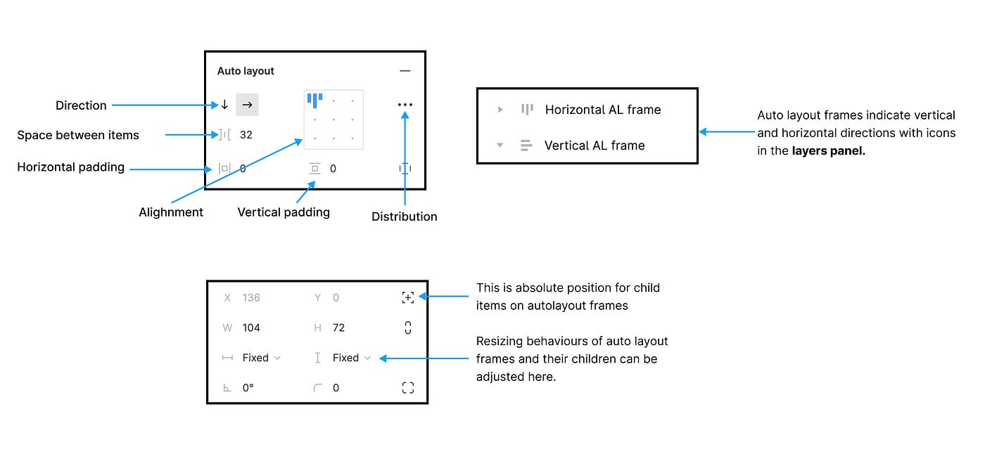
6. Step 4: Apply Auto-Layout to Entire Screen
Select all elements inside the frame.
Press Shift + A (Apply Auto-Layout).
In right panel, set:
Direction: Vertical
Spacing between items: 16 px
Padding:
Top: 24
Bottom: 24
Left: 20
Right: 20
Alignment: Center
Result:
All elements align automatically
Proper spacing maintained
Screen looks clean and professional
LLO 5.1 Achieved
7. Step 5: Create Auto-Layout Input Field Component
Creating Username Input Component
Select:
Username label
Username input box
Press Shift + A (Auto-layout)
Set:
Direction: Vertical
Spacing: 8 px
Select this group → Create Component
Rename component:
SGP_Input_Field
Repeat same for password OR reuse the same component.
Benefit:
One change updates all input fields.
8. Step 6: Create Auto-Layout Button Component
Select Login button text.
Press Shift + A.
Set:
Padding: 12 px vertical, 32 px horizontal
Alignment: Center
Add background color: Blue (
#1A73E8)Text color: White
Convert to component → Rename:
SGP_Primary_Button
Test Auto-Layout:
Change button text to:
Login to Portal
Button size adjusts automatically.
This is the core benefit of auto-layout.
9. Step 7: Apply Components Back to Main Screen
Delete old input fields and button.
Drag:
SGP_Input_Field (twice)
SGP_Primary_Button
Update text:
Username / Password
Button: Login
Screen becomes component-driven.
LLO 5.2 Achieved
10. Step 8: Create Asset Library (Exam-Important Step)
Text Styles
Create:
Heading Style → SGP Heading
Label Style → SGP Label
Button Text Style → SGP Button Text
Color Styles
Create:
Primary Blue
Background Grey
Text Black
All styles appear under Assets Panel.
LLO 5.3 Achieved
11. Step 9: Create Second Screen (Login Success)
Duplicate frame.
Rename to:
Login Successful ScreenReplace content with:
Text: Welcome to SGP Student Portal
Button: Continue
Apply auto-layout again.
12. Step 10: Add Interaction (Prototype)
Switch to Prototype Mode.
Click Login Button.
Drag arrow to Login Successful Screen.
Set:
Trigger: On Click
Action: Navigate To
Animation: Smart Animate
CO4 and CO5 Achieved
Conclusion:
Thus, a responsive login screen using frames, components, auto-layout, assets, and prototype interaction was successfully designed using Figma.